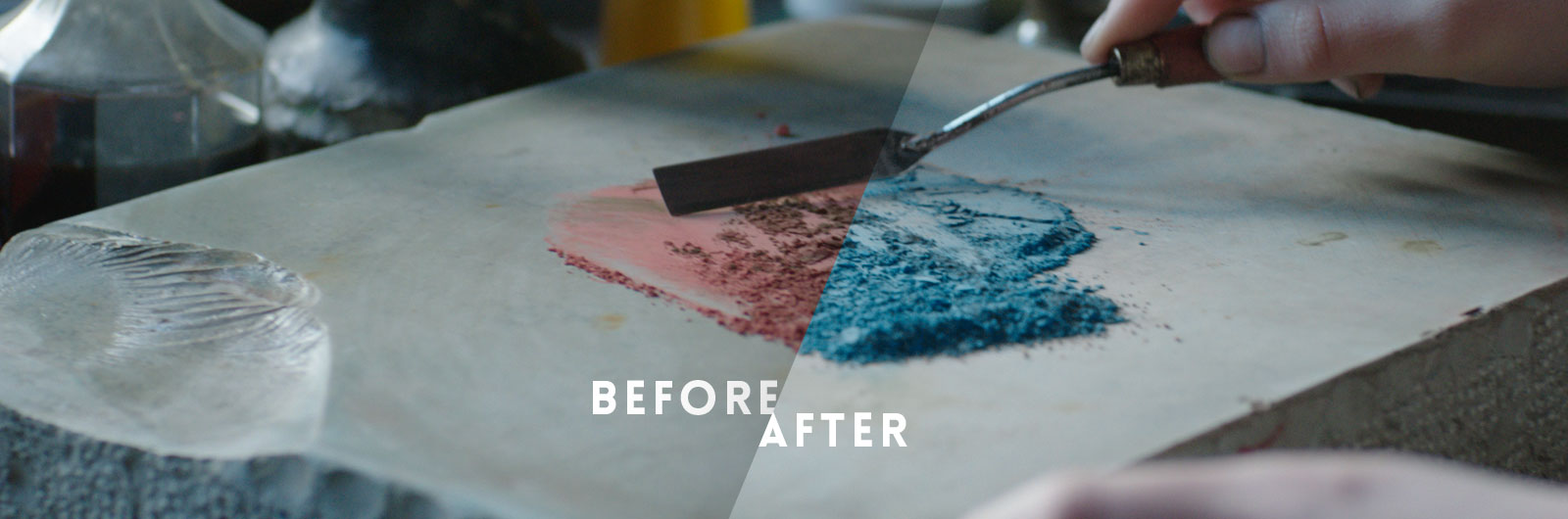
Some VFX were required for the film. The main part was color replacement in order to make the blue color more prominent, both in paintings and pigments, but also some masking of unwanted elements and image stabilization.
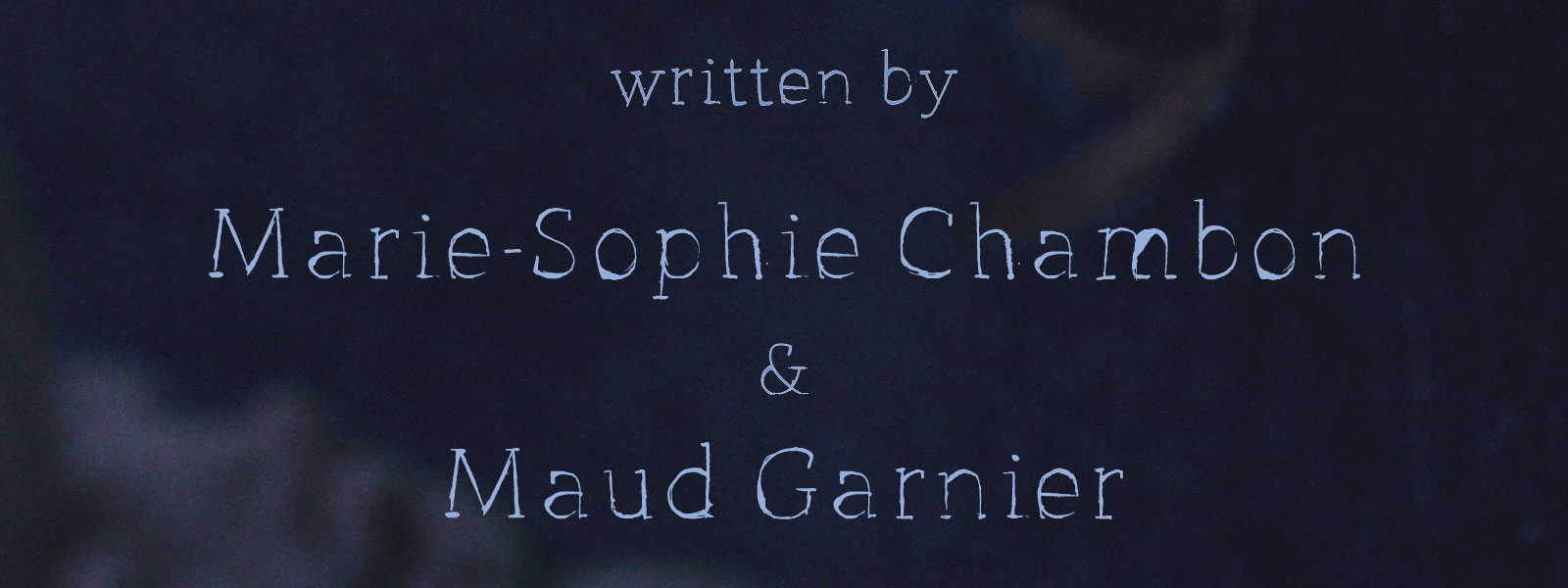
Custom-made font
The font created for the title sequence is based on the StMarie Thin typeface, chosen for its smooth curves and sharp serifs. It was hand-drawn to give a sketchy and unfinished feeling, like the several painting in progress shocased in the film.
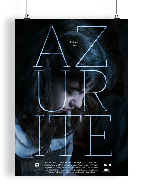
Poster
We needed a poster that reflected what the film was : a period drama shot in a very contemporary way, far from the clichés often expected from genre movies. It is a story about struggles, society boundaries and what you can make to change them.